top of page


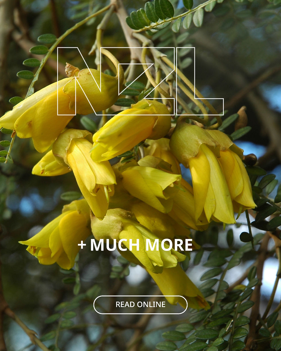
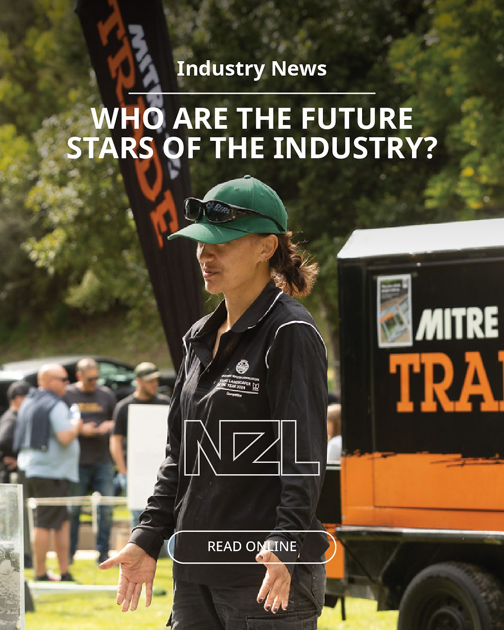


NZ LANDSCAPER BRAND REDESIGN
CLIENT: NEW ZEALAND LANDSCAPER
NZ Landscaper Magazine is a bi-monthly industry publication for professional landscapers, delivering important news, perspectives from operators across the country, industry and business updates, and expert insights.
I lead the design across the NZ Landscaper brand, from the magazine’s editorial layout and visual identity through to its digital presence, including social media, EDMs and website content.


Key design elements:
-
Brand consistency — Established a cohesive visual identity across print and digital, ensuring the brand remains recognisable across every touchpoint.
-
Multi-channel design — Applied the brand across the magazine, social media, EDMs and website content while adapting the design to suit each platform.
-
Editorial design — Created clear layouts and visual hierarchy to make industry news, insights and technical information easy to navigate and digest.
-
Engaging content — Balanced strong imagery, typography and graphic elements to create content that is both informative and visually engaging.
-
Flexible design system — Developed a consistent visual approach that can accommodate a wide variety of editorial topics, advertisers and ongoing content.

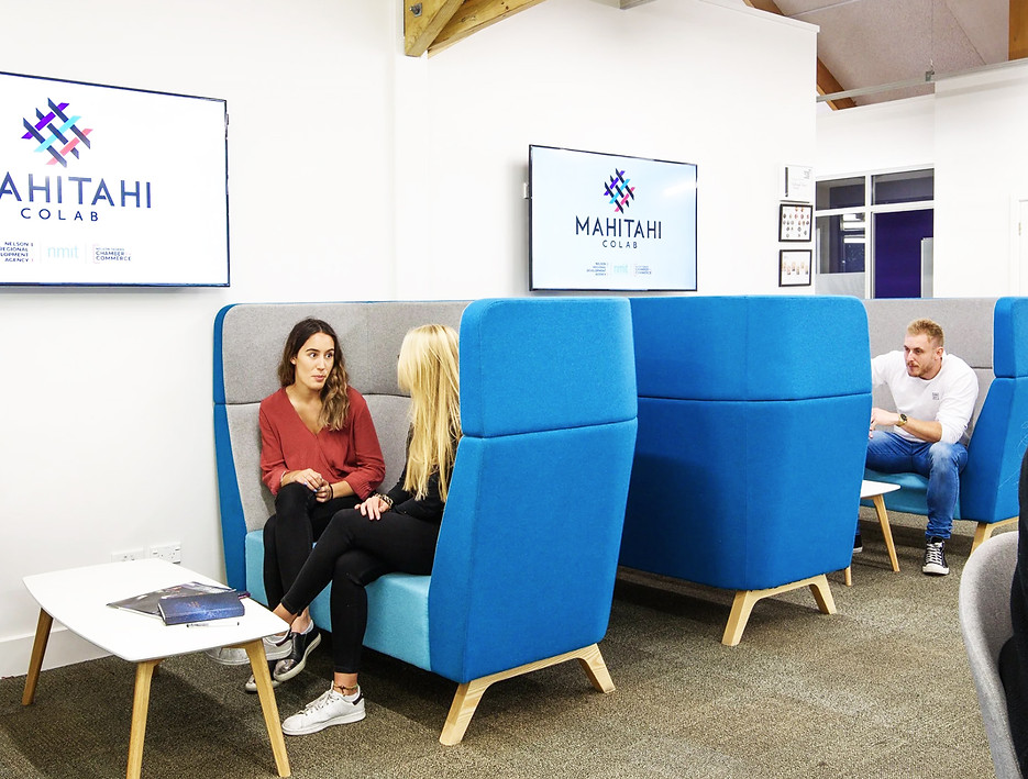

MAHITAHI COLAB IDENTITY
CLIENT: MAHITAHI COLAB
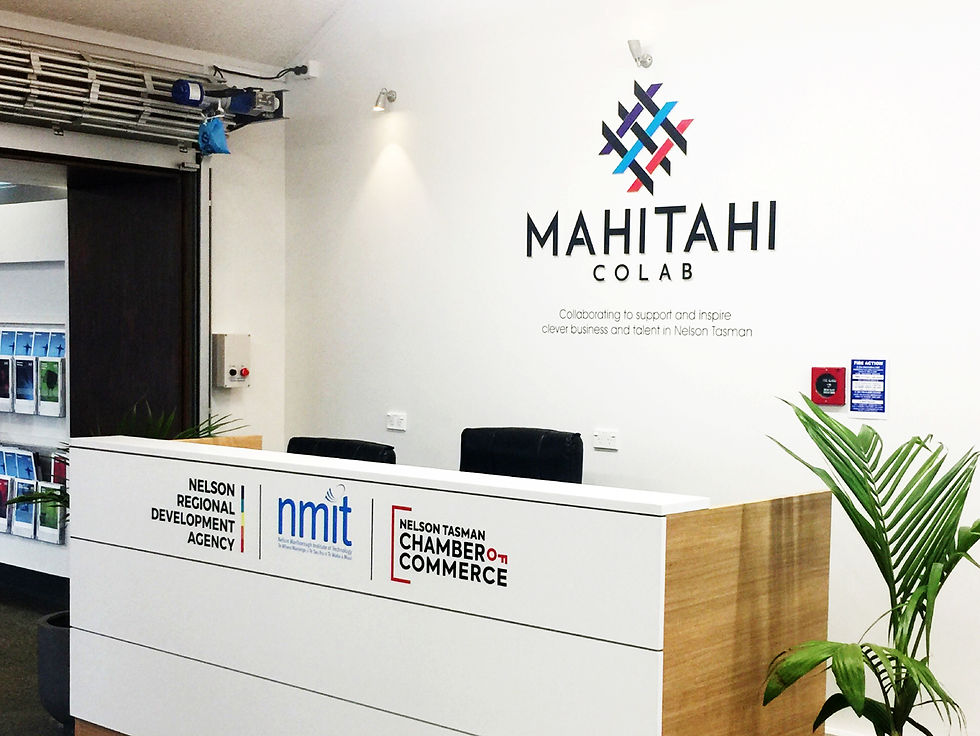
I designed the identity for Mahitahi Colab, a unique partnership between NMIT – Te Pūkenga, Nelson Regional Development Agency and Nelson Tasman Chamber of Commerce. Drawing on colours from each founding organisation, the logo is inspired by raranga (flax weaving), with individual strands coming together to represent connection, collaboration and a shared ambition for innovation across the Nelson Tasman region.
I also helped bring the brand into the physical space, with direct involvement in the signage and environmental design to create a consistent and recognisable presence throughout the site.

Key design elements:
-
Raranga / flax weaving — Inspired by the interwoven strands of raranga, representing people, ideas and organisations coming together.
-
Three founding organisations — Individual elements within the logo represent the three partners united through Mahitahi Colab.
-
Shared colour palette — Draws on colours from each founding organisation, bringing their existing identities into one cohesive brand.
-
Interwoven form — Represents connection, collaboration and the sharing of knowledge and ideas.
-
Environmental application — The identity extends into signage and the physical space, creating a strong and consistent brand presence throughout the site.

GOOD IN THE HOOD
CLIENT: Z ENERGY
I designed a series of infographics for Z Energy’s Good in the Hood programme, highlighting its national reach, community investment and funding impact. Built around bold statistics and quick-scan storytelling, the designs use a flexible modular system to create a consistent visual experience across social media, stakeholder communications and presentations.
.

SIMRAD HALO
CLIENT: SIMRAD YACHTING
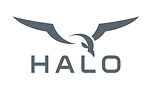
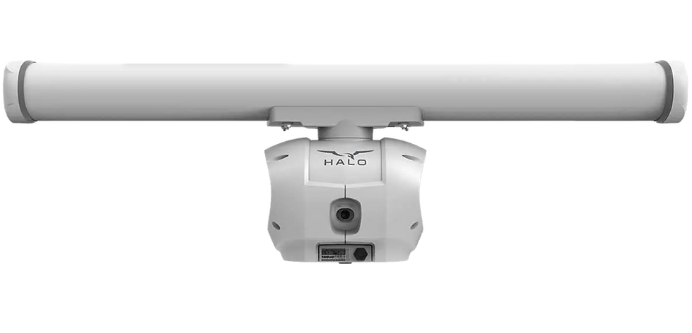
I designed and animated the product logo for the Simrad HALO 2000 and HALO 3000 radar series. Both radars feature powerful Bird modes, designed to help sportfishing enthusiasts locate flocks of birds at a distance and the schools of fish below them.
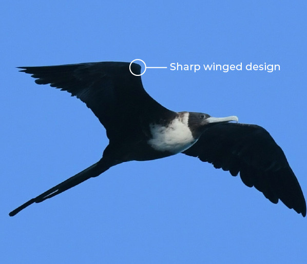
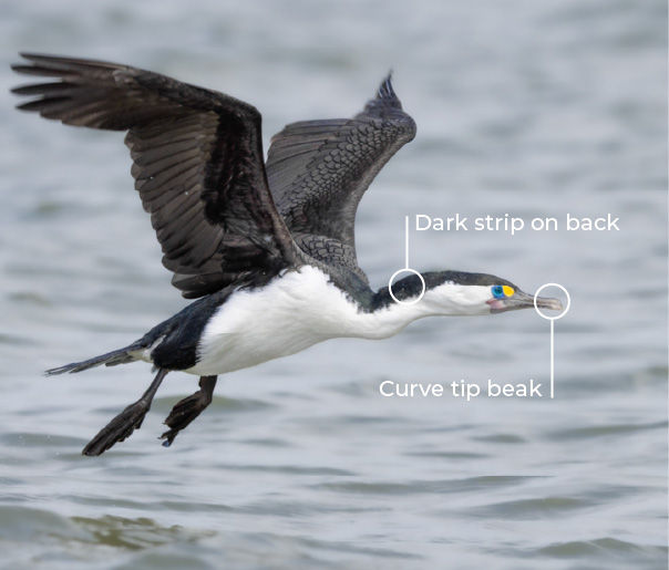
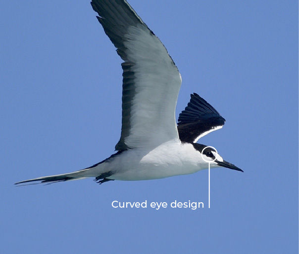
Inspired by the various fishing bird species seen across the globe by Simrad’s fishing audience, the bird icon combines features from several species. Its wide wingspan also reflects the shape and spread of the HALO radar array, bringing the product itself into the design.
Key design elements:
-
Spread wings — Represent HALO’s power and superior radar range.
-
Wide silhouette — Inspired by the shape and proportions of the HALO open array.
-
Keen eyes — Symbolise enhanced visibility and the ability to navigate safely through crowded waters or poor conditions.
-
Seabird form — Connects the identity to the fishing birds used by anglers to help locate fish.
.

A FINE ESCAPE
INDEPENDENT PROJECT
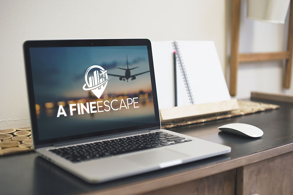
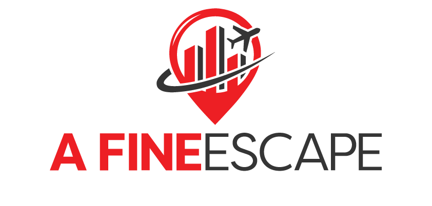
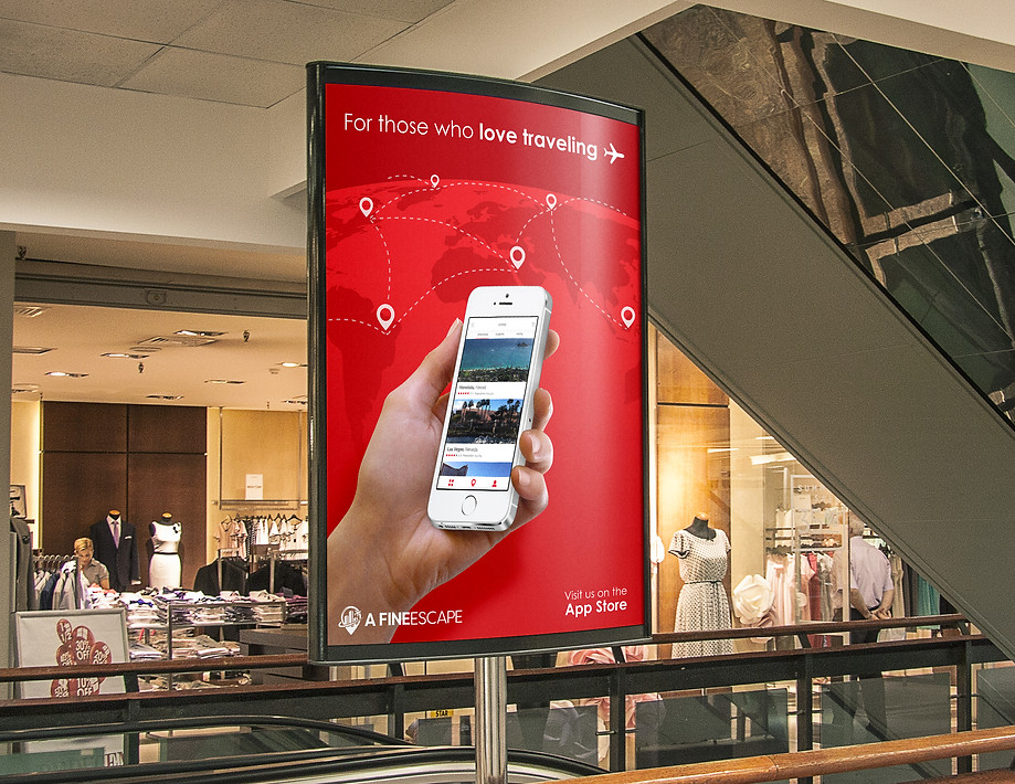
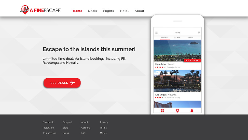
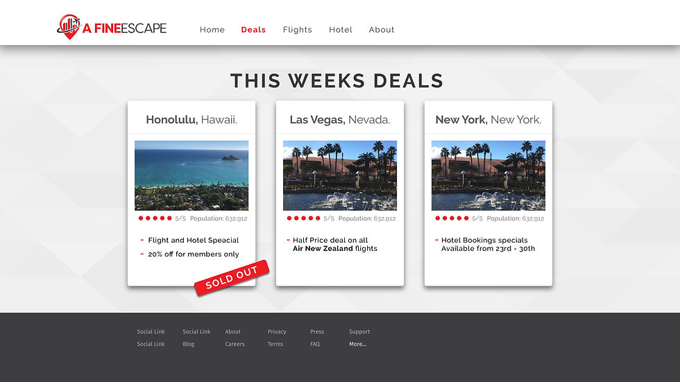
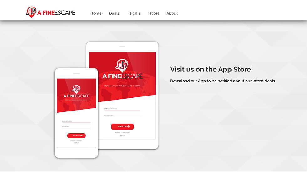
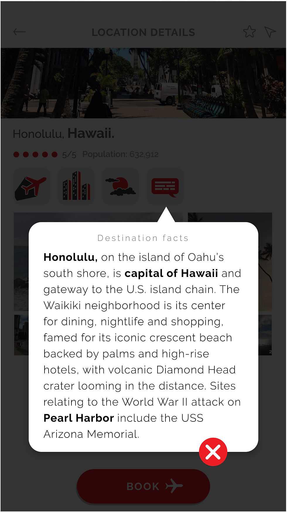
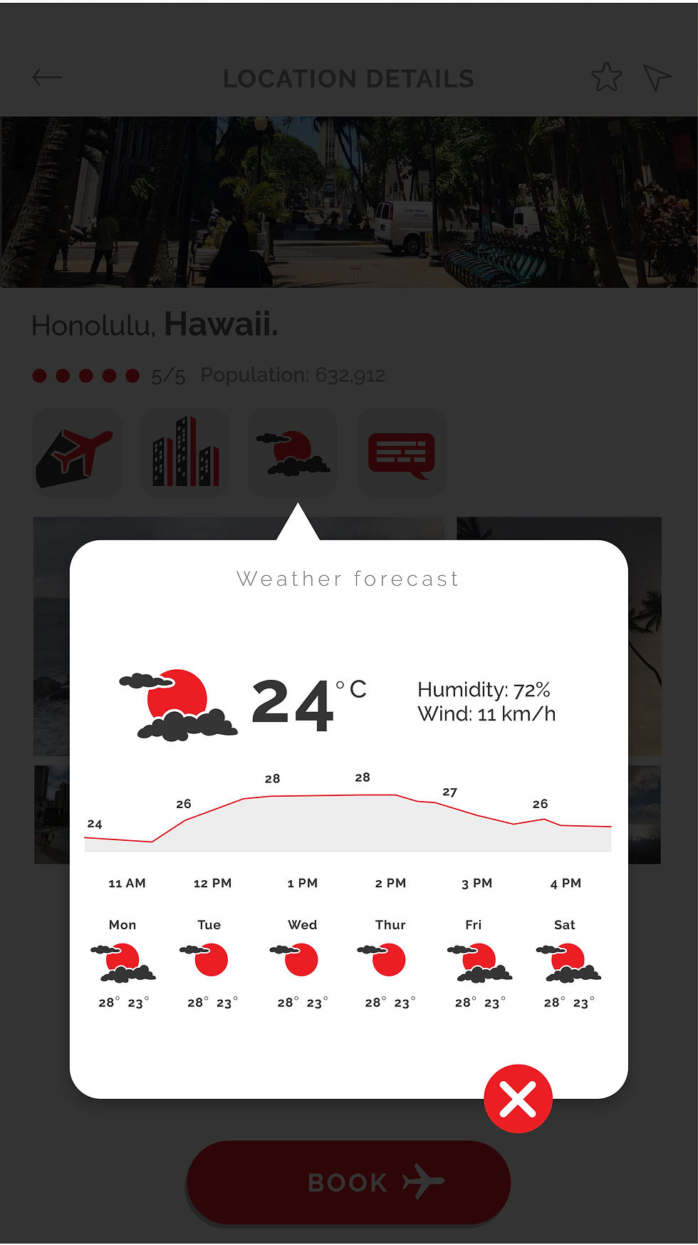
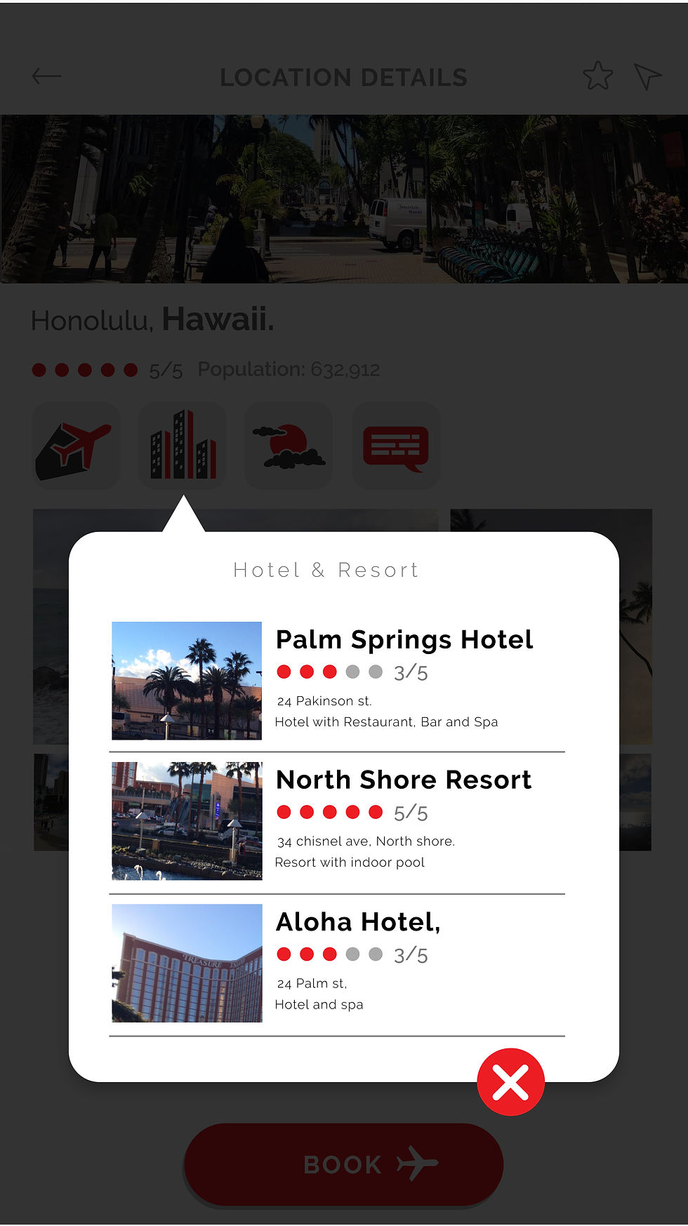
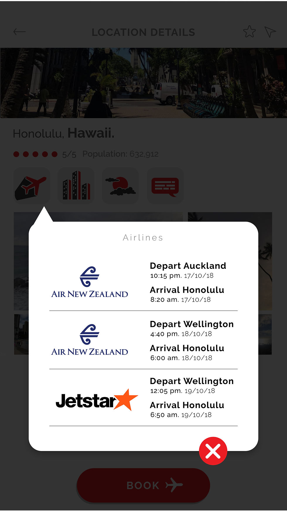
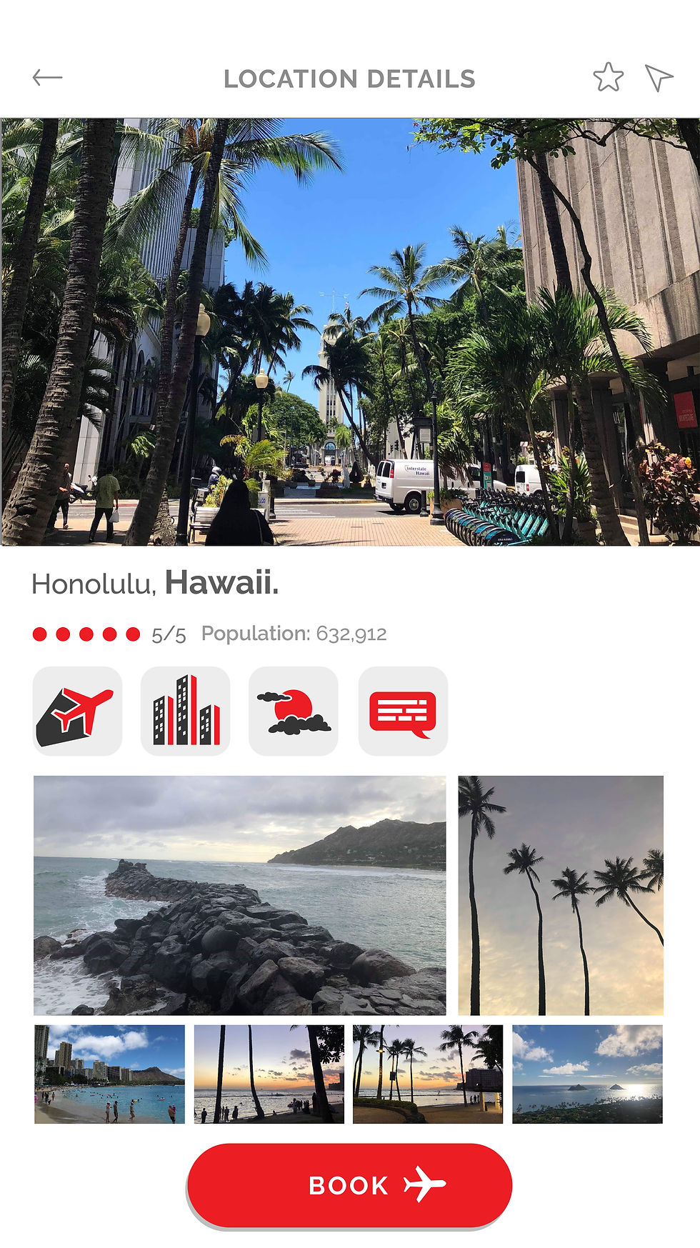
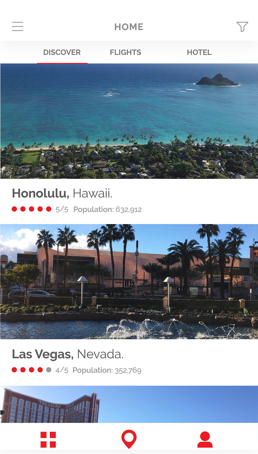
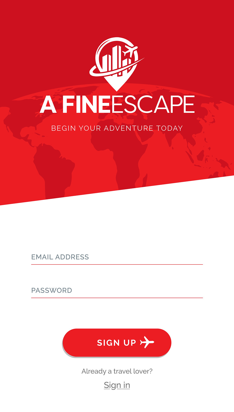
I developed a complete visual identity and digital experience for a travel app, taking the project from initial concept through to final design. The project included logo and brand development, advertising collateral, UI/UX design, and detailed wireframes. The focus was on creating a cohesive, engaging brand and an intuitive user experience that makes discovering and planning travel feel simple and inspiring.
Key design elements:
-
Location pin — Forms the foundation of the identity, representing travel, destinations and discovery.
-
City skyline — Sits at the centre of the icon to represent destinations, experiences and urban exploration.
-
Circling plane — Wraps around the design to communicate global travel, movement and connectivity.
-
Complete coverage — The circular form represents an all-in-one service, covering the full travel journey from discovery through to planning.

KEITH ANDREWS WEBSITE
CLIENT: KEITH ANDREWS
I led the design and visual development of the Keith Andrews website, shaping the overall creative direction, user experience, and visual identity across the site. I worked closely with Clicksuite, who handled the website build, overseeing the design through development to ensure the final experience stayed true to the original vision.


Key design elements:
-
Multi-brand consistency — Created a cohesive website experience across three major vehicle brands, while maintaining enough visual distinction for each brand to retain its own identity.
-
Responsive design — Adapted layouts and content across desktop, tablet and mobile to ensure a consistent experience across different screen sizes.
-
Intuitive user experience — Designed clear navigation and content hierarchy to make exploring vehicles, services and information straightforward and accessible.
-
Engaging functionality — Used interactive elements and considered on-page behaviour to create a more dynamic and engaging browsing experience.
-
Design-to-development oversight — Worked closely with Clicksuite throughout the build to ensure the functionality and finished website remained consistent with the original design direction.





VERTICAL HORIZONZ VALUES
CLIENT: VERTICAL HORIZONZ
Vertical Horizonz is a values-driven organisation. I designed Māori-inspired icons to represent their company values, which serve as guiding principles that shape their culture, decision-making and behaviour.
Key design elements:
-
Integrity — Heart & hand — Combines the shape of a heart with the gesture of a hand or fist held to the chest, representing honesty, sincerity and staying true to your values.
-
Empower — Matau / fish hook — Based on the form of a Māori fish hook, traditionally associated with strength, prosperity, abundance and safe journeys. The upward form also gives the icon a sense of growth and empowerment.
-
Respect — Koru & handshake — Two koru-inspired forms encircle one another to represent balance, harmony and mutual connection, while also forming a handshake to symbolise respect, trust and understanding.
-
Leadership — Direction & mangōpare — An upward arrow represents direction, progress and leading the way, while the mangōpare-inspired forms reference the hammerhead shark and qualities of strength, courage, tenacity and leadership.
-
Collaboration — Raranga / weaving — Inspired by the interweaving of flax, with individual strands coming together to represent collaboration, connection and working towards a shared purpose.

35 BY 35
CLIENT: HUTT VALLEY CHAMBERS OF COMMERCE
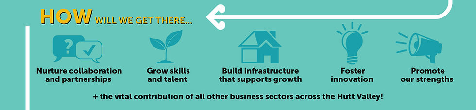
The design challenge was to turn the Hutt Valley Chamber of Commerce’s detailed ten-year economic strategy into a clear and engaging publication. I developed a strong visual hierarchy, using typography, imagery, infographics and data visualisation to make complex information easy to navigate. I also distilled the strategy into a single-page roadmap, bringing the key goals and milestones together at a glance.



Key design elements:
-
Infographic design — Transformed large volumes of data and complex information into concise, visually engaging infographics that communicate key insights at a glance.
-
Data visualisation — Used graphs, charts and visual devices to make economic data easier to understand and compare.
-
Information hierarchy — Structured a detailed ten-year strategy into clear sections, helping readers navigate key goals, statistics and recommendations.
-
Community & economic growth — Used imagery and visual storytelling to highlight the strategy’s focus on strengthening local communities, businesses and the wider Hutt Valley economy.
-
Strategy at a glance — Distilled the wider report into a single-page roadmap, bringing key milestones and the goal of 35% GDP growth by 2035 into one clear visual summary.

PERMCON BRAND COLLATERAL
CLIENT: PERMCON NZ
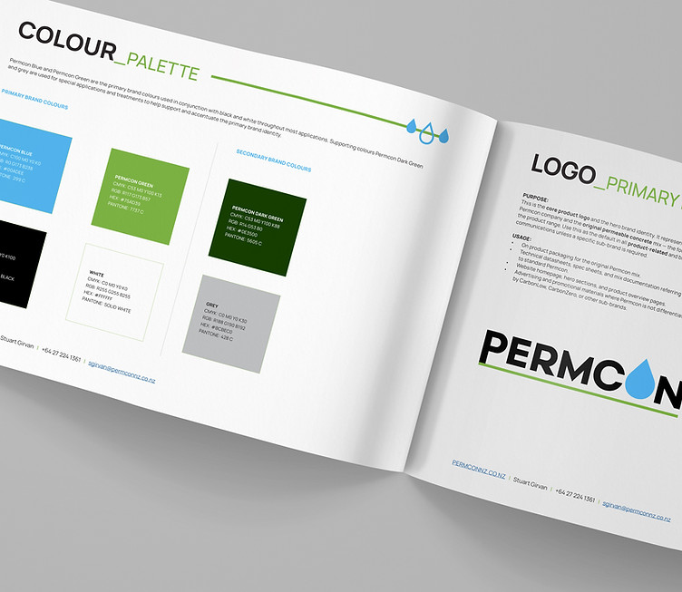
Permcon is a permeable concrete system designed for New Zealand conditions. It combines strength and durability with proven stormwater performance, helping reduce runoff, filter pollutants, and protect our streams and rivers.
I designed a range of marketing collateral to help bring the Permcon brand to life across print and digital touchpoints, including flyers, promotional flags, social media content, and animated videos.





Key design elements:
-
Brand consistency — Maintained a cohesive visual identity across print, digital, social and motion content, creating a recognisable brand across multiple touchpoints.
-
Multi-format design — Adapted the visual language across everything from printed flyers and large-format flags to social media and animated video.
-
Technical communication — Turned detailed product information and performance benefits into clear, accessible visuals for a broad audience.
-
Environmental focus — Used imagery and graphic elements to reinforce Permcon’s connection to stormwater management, sustainability and protecting New Zealand waterways.
-
Engaging content — Combined strong typography, graphics, photography and motion to communicate Permcon’s benefits in a more visually engaging and memorable way.

THE CITIES OF NEW ZEALAND
INDEPENDENT PROJECT
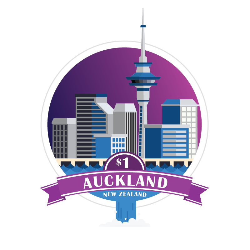
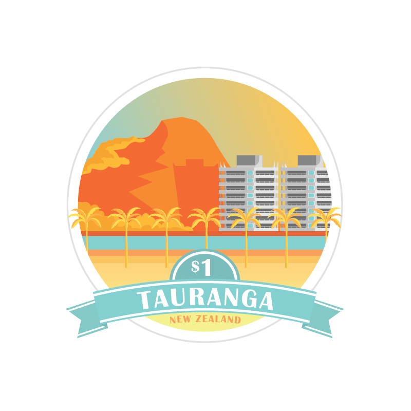
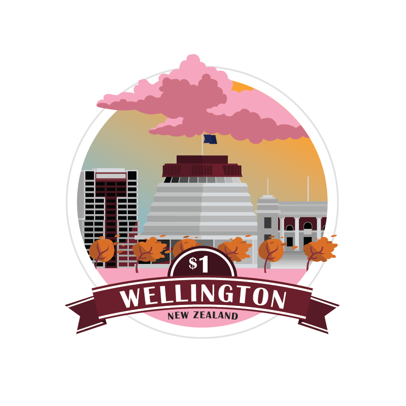
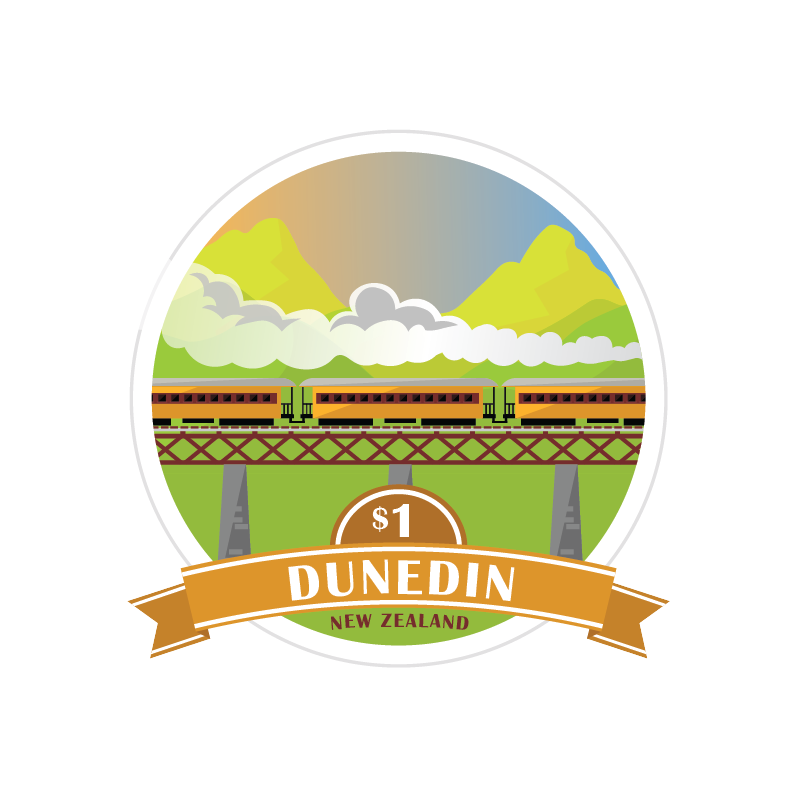
A series of illustrated New Zealand city stickers, each featuring iconic local landmarks. Peel back a sticker to reveal the city's location on the map below, turning a simple map into an interactive way to explore the country.





Key design elements:
-
Recognisable landmarks — Illustrated each city through its most iconic architecture, landmarks and defining features, making each location immediately recognisable.
-
Local identity — Incorporated imagery with historical, cultural and geographic relevance to capture what makes each city distinct.
-
Consistent illustration style — Developed a unified visual language across the series while giving every city its own individual character.
-
Interactive design — Used peel-away stickers to turn a traditional map into a hands-on experience, revealing each city’s geographic location beneath the illustration.
-
Information through illustration — Combined illustration and cartography to make learning about New Zealand’s cities and geography more visual, accessible and engaging.

ART DECO TRAVEL POSTERS
INDEPENDENT PROJECT
A collection of illustrated posters inspired by the Art Deco movement, each capturing the character of a different New Zealand city through stylised landmarks, colour, and geometric design.

bottom of page